Your brand logo is like your newsletter’s friendly face
Imagine sending out emails without your logo – it just doesn’t feel right, especially if you’re not going for that ultra-personal, “just between us” vibe that some cold outreach attempts mimic.
Think about it: names might slip your mind now and then, but a familiar image sticks with you. That’s the superpower of your logo. It’s not just a picture; it’s a memory hook, making sure your audience keeps you in mind with just a glance.
So, where does this friendly face belong in your email? Right at the top, in the spotlight, within the first 20% of your email. It’s like welcoming someone with a smile – it sets the tone.
Most of us stick to the tried-and-true method of centering our logo right at the beginning. It’s like saying, “Hey, you’re in the right place!” But, every so often, you might have something special to shout about – a new partnership, a killer guide, an unmissable report, or a time-sensitive offer.
Here’s a fun idea: mix it up with an image that highlights your special news and sneak your logo in there, almost like saying, “Brought to you with love from [Your Logo].”
A little about placement and colors:
Placement-wise:
- Giving your logo its own space at the top is like giving it a solo performance – it’s the first thing people see, making a strong impression.
- Or, maybe you play it cool by placing it to the side, adding a catchy motto or your contact info on the other. Just remember, we’re going for cozy, not crowded, especially on those tiny phone screens.
- And don’t forget, slipping your logo in at the end with a softer color keeps it from stealing the show but makes sure it’s there, like a signature on a letter.
Color talk:
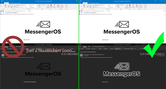
Logos are usually chameleons, blending in anywhere, but the dark mode on phones can turn this into a game of hide and seek.
If you’ve got a dark logo, it might just vanish into the background in dark mode. Here’s how you can keep it visible:
- A little trick with an image editor can add a glow, making your logo pop out of the dark, like it’s lit from within.
- Or, create a banner that’s in tune with your newsletter’s vibe, with a backdrop that makes your logo stand out. Just make sure it looks like part of the gang with the rest of your email’s look.
- Putting your logo at the bottom? Same rules apply. Make it noticeable, not a game of “Where’s Waldo?”
When it comes down to it, your email should feel like a cozy chat, consistent and familiar, whether it’s popping up in Outlook or Gmail. Stick to the fonts and styles that work everywhere, and always, always give it a look-see in both light and dark modes. It’s all about keeping that warm, welcoming vibe, no matter where your email lands.